Dr. C. George Boeree
A perfect correlation is +1.
Very close to perfect would be a
comparison of men's shoe size and their... foot length. For
example, here is some data:
| Shoe size |
Foot length (inches) |
|
| John |
4 1/2 |
9 1/4 |
| Dave |
5 |
9 3/8 |
| Sam |
5 |
9 1/4 |
| Jim |
6 1/2 |
9 1/2 |
| Ed |
6 1/2 |
9 3/4 |
| Bob |
7 |
9 3/4 |
| Ted |
8 |
10 1/8 |
| Matt |
11 1/2 |
11 |
| Damian |
12 |
11 1/4 |
| Horton |
14 |
11 3/8 |
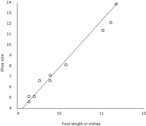
We can arrange the data on a chart like this:

This is called a scatter plot.
The line is the line that
describes the "best fit" -- in
other words, it accounts for the data
most nicely. This one is not perfect -- apparently, some guys buy
shoes that are too tight, and some buy shoes that are too loose!
But you can see by comparing the dots to the line, it's pretty close to
a +1 correlation.
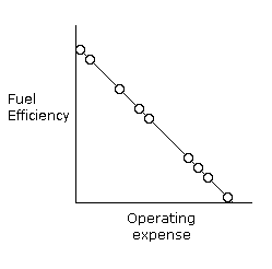
Perfect correlation can also be -1.
An example would be your
car's fuel efficiency and how much money you need to spend for gas per
so many miles. It should look like this:

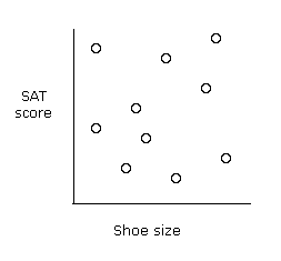
Most things have a correlation of 0
(or close to it). An example would be your
shoe size vs your... SAT score.

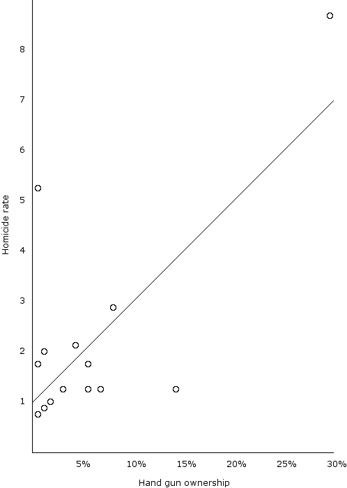
For a more real life example of data, along with a scatter plot and an actual correlation, is this one, which compares homicide rates with hand gun ownership. (The figures are real for the late 1980's.)
| Country |
Homide rate (per 100,000 per year) |
Hand gun
ownership (% of population) |
| USA |
8.8 |
29.0 |
| Northern Ireland |
5.2 |
1.5 |
| Finland |
2.9 |
7.0 |
| Canada |
2.1 |
4.0 |
| Australia |
2.0 |
2.0 |
| Scotland |
1.8 |
0.5 |
| Belgium |
1.8 |
6.0 |
| Switzerland |
1.2 |
14.0 |
| Norway |
1.2 |
3.5 |
| France |
1.2 |
5.5 |
| West Germany |
1.2 |
6.5 |
| Spain |
1.0 |
2.0 |
| The Netherlands |
0.9 |
1.0 |
| England and Wales |
0.7 |
0.5 |

And the correlation: +.70. That is quite impressive, and maybe it says something about the various societies. If you are wondering about Switzerland's figures, it should be noted that every adult male is trained in the army and is required to maintain weapons in his home -- just in case they get invaded by, say, Italy. On the other hand, you can see that Northern Ireland has a high homicide rate even though few people own guns. I think you can guess why!
If you would like a more meaningful number than correlation itself, you can square it. This will give you a number that tells you how much of the variance (variation) in one or the other of the variables is "explained" by the other. So, for example, the .70 correlation above tells us that 49% of the variation in homicide rates is related to the ownership of hand guns. That leaves us with 51% of the variation we still need to account for.
In psychology, we are generally impressed by correlations of .3 and higher. .8 or .9 blows us away.
But one thing correlation cannot tell you is causality.
Your grades and your SATs correlate pretty well -- but which causes
which?
Even the homicide-hand gun example doesn't give you causation.
Odds are always that there is something else that causes (or partially
causes) two things to correlate. Perhaps coming from richer
parents leads to both good grades and
high SATs. Maybe a violent
culture leads to both more guns and
more violence. It takes other
kinds of research -- most especially experiments
-- to pin down cause
and effect!
© Copyright 2005, C. George Boeree