Descriptive statistics are ways of summarizing large sets of
quantitative (numerical) information. If you have a large number
of measurements, the best thing you can do is to make a graph with all
the possible scores along the bottom (x axis), and the number of times
you came across that score recorded vertically (y axis) in the form of
a bar. But such a graph is just plain hard to do statistical
analyses with, so we have other, more numerical ways of summarizing the
data.
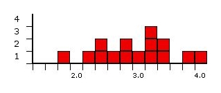
Here is a small set of data: The grades for 15 students.
For our purposes, they range from 0 (failing) to 4 (an A), and go up in
steps of .2.
Here is the information in bar graph form:

Central tendency
Central tendency refers to the idea that there is one number that
best summarizes the entire set of measurements, a number that is in
some way "central" to the set.
The mode. The mode is
the
measurement that has the greatest frequency, the one you found the most
of. Although it isn't used that much, it is useful when
differences
are rare or when the differences are non numerical. The
prototypical
example of something is usually the mode.
The mode for our example is 3.2. It is the grade with the most
people (3).
The median. The median
is the
number at which half your measurements are more than that number and
half are less than that number. The median is actually a better
measure of centrality than the mean if your data are skewed, meaning
lopsided. If, for example, you have a dozen ordinary folks and
one
millionaire, the distribution of their wealth would be lopsided towards
the ordinary people, and the millionaire would be an outlier, or highly
deviant member of the group. The millionaire would influence the
mean
a great deal, making it seem like all the members of the group are
doing quite well. The median would actually be closer to the mean
of
all the people other than the millionaire.
The median for our example is 3.0. Half the people scored
lower, and half higher (and one exactly).
The mean. The mean is just the average.
It is the sum of all your measurements, divided by the number of
measurements. This is the most used measure of central tendency,
because of its mathematical qualities. It works best if the data
is distributed very evenly across the range, or is distributed in the
form of a normal or bell-shaped curve (see below). One
interesting thing about the mean is that it represents the expected value if the distribution
of measurements were random! Here is what the formula looks like:

Statistical dispersion
Dispersion refers to the idea that there
is a second number which tells us how "spread out" all the measurements
are from that central number.
The range. The range
is the
measure from the smallest measurement to the largest one. This is
the
simplest measure of statistical dispersion or "spread."
The range for our example is 2.2, the distance from the lowest
score, 1.8, to the highest, 4.0.
Interquartile range. A
slightly more sophisticated measure is the interquartile range.
If you
divide the data into quartiles, meaning that one fourth of the
measurements are in quartile 1, one fourth in 2, one fourth in 3, and
one fourth in 4, you will get a number that divides 1 and 2 and a
number that divides 3 and 4. You then measure the distance
between
those two numbers, which therefore contains half of the data.
Notice
that the number between quartile 2 and 3 is the median!
The interquartile range for example is .9, because the quartiles
divide roughly at 2.45 and 3.35. The reason for the odd dividing
lines is because there are 15 pieces of data, which, of course, cannot
be neatly divided into quartiles!
The standard deviation. The standard
deviation
is the "average" degree to which scores deviate from the mean.
More precisely, you measure how far all your measurements are from the
mean, square each one, and add them all up. The result is called
the variance. Take the
square root of the variance, and you have the standard deviation.
Like the mean, it is the "expected value" of how far the scores deviate
from the mean. Here is what the formula looks like:

So, subtract the mean from each score and square them and sum:
5.1321. Then divide by 15 and take the square root and you have
the standard deviation for our example: .5849.... One
standard deviation above the mean is at about 3.5; one standard
deviation below is at about 2.3.
The
normal curve
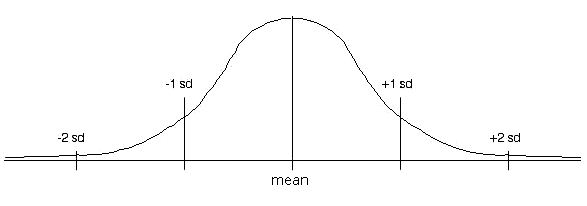
At its simplest, the central tendency and the measure of dispersion describe a rectangle that is a summary of the set of data. On a more sophisticated level, these measures describe a curve, such as the normal curve, that contains the data most efficiently.
This curve, also called the
bell-shaped curve, represents a distribution that reflects certain
probabilistic events when extended to an infinite number of
measurements. It is an idealized version of what happens in many
large
sets of measurements: Most measurements fall in the middle, and
fewer
fall at points farther away from the middle. A simple example is
height: Very few people are below 3 feet tall; very few are over
8 feet tall; most of us are somewhere between 5 and 6. The same
applies to weight, IQs, and SATs! In the normal curve,
the mean, median, and mode are all the same.

One standard deviation below the mean contains 34.1% of the
measures, as does one standard deviation above the mean. From one
to two below contains 13.6%, as does from one to two above. From
two to three standard deviations contains 2.1% on each end. An
other way to look at it: Between one standard deviation below and
above, we have 68% of the data; from two below to two above, we have
95%; from three below to three above, we have 99.7%
Because of its mathematical properties, especially its close ties to
probability theory, the normal curve is often used in statistics, with
the assumption that the mean and standard deviation of a set of
measurements define the distribution. Hopefully, it is obvious
that this is not at all true for nearly all cases. The best
representation of your
measurements is a diagram which includes all the measurements, not just
their mean and standard deviation! Our example above is a clear
example - a normal curve with a mean of 2.92 and a standard deviation
of .58 is quite different from the pattern of the original
data. A good real life example is IQ and
intelligence: IQ tests are intentionally scored in such a way
that they generate a normal curve, and because IQ tests are what we use
to measure intelligence, we often assume that intelligence is normally
distributed, which is not at all necessarily true!