|
Module 1
Visual Data Representation
Introduction
During your academic and business careers you have become familiar with
many new terms and expressions. Some rather new expressions that have
shown up in the popular press recently are data mining, knowledge discovery,
and information gathering. Data mining, as originally described, is extracting
previously unknown and potentially useful information from a large data
set, typically using sophisticated analytical techniques, such as artificial
intelligence. One goal is to express the data in a statistical or visual
form, comprehendible by humans, so that it is useful in the decision making
process. You, as decision-makers, must be able to understand the data
in its new form and have some appreciation of the techniques and methodology
used to gather, analyze, present, and interpret it.
In this module, we will not
learn the intricacies of data mining but rather we will learn some terminology
and the basics of how to represent data in tabular and graphical forms.
One goal is to learn to use Microsoft Excel (Version 97, 2000, or XP)
as a tool for building tables and graphs that can be used for information
dissemination and decision making. If you haven't used Excel regularly,
some of your time early in the course will be spent relearning the basic
element.
Tabular
Representations of Data
Let's gather some data. We are interested in the family size of employees.
One data set that might be of use is the number of siblings each employee
has. This is just an exercise; in the real world you would want to spend
time deciding what information you need and what you want to use it for.
What are some of the questions or concerns associated with gathering this
information? We'll use the data already gathered at Siblings.html.
We will use this data to construct a table, specifically a frequency distribution
table, and a graph of this data. Note: To get the sibling data into Excel,
go to Siblings.html with your web browser (Netscape, Internet Explorer,
etc.). Do a File-Save as and save the web page to a handy file
location. Now start Excel and do a File-Open. You may not see the
Sibling.html file unless you change the Files of type selection
(near the bottom of the Open dialog box) to All files.
Once the file is open you can format the cells anyway you want.
After gathering the information and recording it to a spreadsheet, the
next step is to organize the raw data into a tabular form. This condenses
the data for easy reading and little information is lost in the conversion.
What information do we lose? The table we will construct is called a frequency
distribution table. Much of the remaining material in this course will
involve frequency distributions and corresponding tables. They are extremely
useful and will be used in numerous situations in this course and in the
business world.
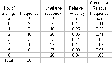
A frequency distribution in table form is typically shown with two columns.
The left column contains the values of the variables; the right, the frequency
(or count) with which each value occurs. This frequency or actual count
is sometimes called the absolute frequency to differentiate it from other
measures we will be introduced to shortly. The (absolute) frequency distribution
table for siblings is called an ungrouped frequency distribution, as each
value that the variable can take on is a category unto itself. That is,
each random variable value is its own group.
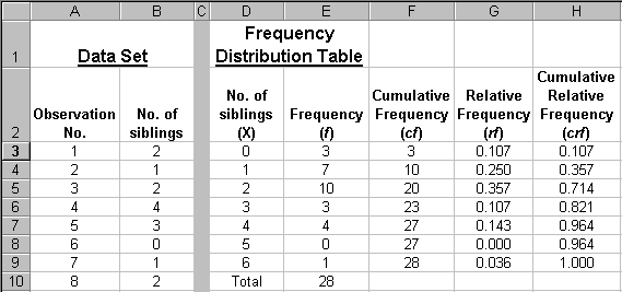
There are other ways of depicting the information in tabular form. Three
introduced here are cumulative (absolute) frequency, relative frequency,
and cumulative relative frequency. Using our sibling data, extend the
frequency distribution table to include these three types. In the table
below, the "X" column contains the No. of siblings.
The "f" column, contains the actual count of observations or absolute
frequency with which a value occurs. It shows how often a particular number
of siblings occurs in the data set. The absolute frequency shows how many
people have X siblings.
"cf", the cumulative frequency, indicates how often a particular
number of siblings or fewer occurs. Another interpretation is, "How many
people have X or fewer siblings?"
"rf", the relative frequency, is the proportion or percentage,
rather than the count, of the observations that have a particular value.
It is calculated as f / total number. The interpretation is the percent
(or proportion) of the people having X siblings.
"crf", the cumulative relative frequency, is the proportion or
percentage of people that have X siblings or less. Since rf and crf are
proportions or percentages of the whole there can never be an entry of
less than zero or greater than 1 in these columns. The last entry in the
crf column will always be 1.00 (or 100%)
Use the data to complete the frequency column then verify the remaining
cell values in the table below using your calculator.
Now,
you are going to use Excel to make the same frequency distribution table
we just completed by hand.
Constructing a frequency distribution
table using Excel.
- To start, open Excel and
start a new workbook if you need to. Name a worksheet "Siblings" by
double-clicking on the tab (at the bottom that says "Sheet1") and typing
the new name. Make sure you know the difference between workbook and
worksheet.
- Set up your column headings
to look something like the headings in step 5 below. Experiment, it
doesn't have to look exactly the same as this one. Hint: To get the
headings "stacked" and/or across multiple columns, experiment with the
word wrap and merge cells selections in the Format-Cell-Alignment
dialog box.
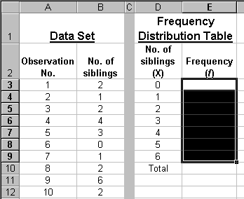
- Enter the observation numbers
(not the observation values), 1 through 28 (the number of values in
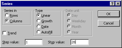
the data set), starting in cell A3. A good way to do this is to use
the Edit-Fill-Series command. Enter a "1" in cell A3. Select
cell A3. Select Edit-Fill-Series from the drop-down menu, select
"Columns" (since your numbers go down the A column), Step value to 1
(we want to count by ones), and set Stop value to 28, the number of
observations in the sibling data set. Click on OK. Neat, eh?
- Now, enter the Sibling data into column B as shown in step 5 below.
- In cells D3 through D9, type in the possible values for the number
of siblings, 0, 1, 2, through the maximum in your data set. (The maximum
is 6 in this example.) These are the values that X, the random variable,
the number of siblings, can take on.
- Now we want to put Excel to work. Excel has the capability of automatically
doing the "Tally" (that you did by hand) then putting the results into
the frequency distribution table. We will use the =frequency
function. Follow the directions very carefully to make it work.
- The = frequency function
has the form =frequency(data array, bin array). (You can read
about it under the Help menu.) To make it work, you need to "tell" Excel
where your data are (data array) and where the "X" values
in your table (bin array) are. You can either type the function into
the cell directly or use the "Paste Function" icon (the little fx)
in the Standard toolbar. Let's use the Paste Function.
Before you select the function, highlight the cells into which
your results will be put. See the highlighted cell above.
In this example, cells E3:E9. (Recall in Excel, a colon here, "E3:E9",
means cells E3 through E9.) Now click the Paste Function icon and select
the "Statistical Function" category then "Frequency".
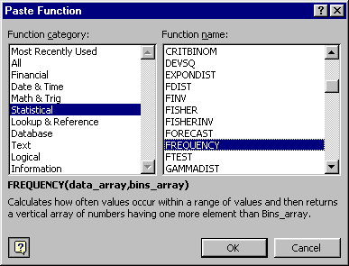
OK will give you the following dialog box.

- Now fill in the Data_array and Bin_array by either typing in the cell
ranges or using the red arrows that enable you to highlight the cell
ranges. If you haven't used the arrows before, click on them to see
what happens. They can be handy if your cell ranges are not too large. You actually don't even have to use the red arrows - if you put your cursor in the appropriate box, you can just highlight the cells on the spreadsheet. Try it! In this example, there are 28 observations in cells B3:B30 and the "bins", the values that the random variable X can take on, in cells D3:D9, so the dialog box should look like this when finished.
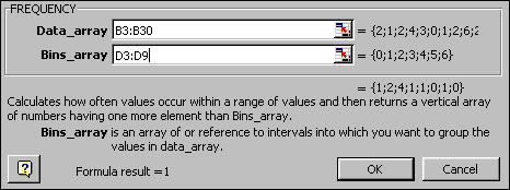
- Don't click on OK yet, or it won't work. Since you highlighted
multiple cells before you started this function (You did, didn't you?),
you are working with an array function. To make this work, clicking
on OK or hitting Enter is not enough. You must hold down both the Ctrl
and Shift keys, simultaneously, while clicking OK or pressing Enter.
If you mess it up, simply delete what you have tried and start over.
If it seems to be stuck, press Esc. The cells that you highlighted in
column E should be filled in. They should have exactly the same numbers
in them as the table you built by hand.
Extensions to the basic frequency distribution table
Now, let's use Excel to find cumulative, relative, and cumulative frequency.
I stress "use Excel" as many students want to find the results with a
calculator, then type the numbers into the spreadsheet. Don't!!
- Type in the appropriate column headings in cells F2:H2. We want Excel
to do most of the work so you need to learn how to type formulas that
can be copied.
- To start, type the sum function in the cell below your last number
in the frequency column. In my example, cell E10 contains =sum(E3:E9).
Use the formula, don't just add the number in your head or on a calculator
then type the number in.
- To complete the cf column, enter =sum($E$3:E3) in cell F3,
then copy it down to F9. Three points:
- You should understand enough about the copy command and relative
and absolute addressing to see how this formula works; if not, hit
the books.
- There are other ways to accomplish the same results with different
formula.
- You should know several ways to copy the formula from F3
to F4:F9; if not, hit the books. Regardless, you should be able
to type formulas into one or two cells then copy those to finish
the table.
- To complete the rf column, type =(E3/$E$10) ( Do you understand
what is happening here?) into cell G3 and copy it down. Make sure you
know how to set the number of decimal points; three is adequate here.
Complete the crf column using the same technique you used for
the cf column.
- It is easy to demonstrate why using formulas is important. In your
original data set, change the value of the first random variable in
your data set; increase or decrease it by 1 and watch what happens to
your table. All of your results changed to reflect the new value without
you having to do anything else! This is a very powerful tool! Finally,
a reminder - make sure you not only build tables but can interpret the
results.
Graphical
Representation of Data
Once we have data organized
in tabular form we can represent it as a graph. We are going to build
a basic histogram (also called, for the time being, a bar graph or frequency
distribution graph) using Excel Chart Wizard. Again, there are numerous
approaches to building and modifying graphs; the method shown below is
just one, and not necessarily the most correct, easiest, or clearest for
everyone.
Mechanics of constructing
a basic histogram
- Highlight values in the
frequency (f) column (don't include the total), E3:E9, and click
on the chart wizard icon. (Now might be a good time to turn on the ScreenTips
associated with the cursor. The command is in Tools-Customize-Option.
ScreenTips are sometimes handy when constructing graphs. The tips show
themselves about 1.5 seconds after you point to items such as an icon.
)
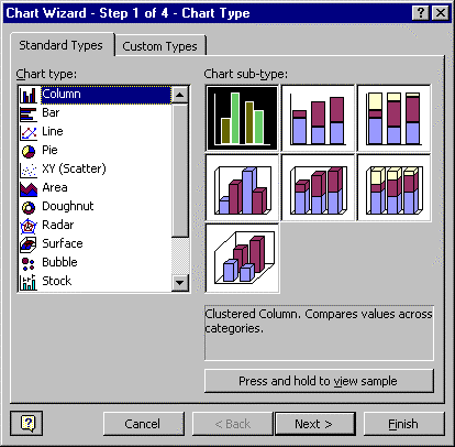
- In Chart Wizard Step 1, select Standard Types, Column (you can play
with Custom Charts at your leisure). Select the upper left box. Then
use "next" to go to Step 2. Or you can double click on the box to go
to the next step.
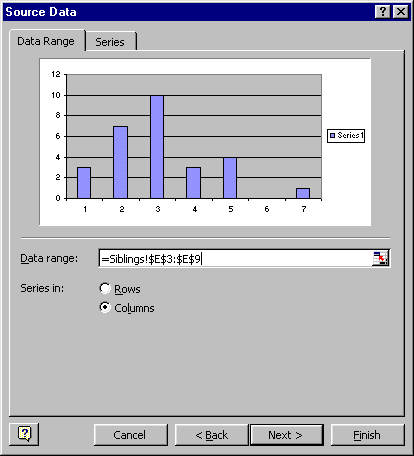
- Step 2 in Chart Wizard causes problems for some students. You have
the start of graph but there is much to do to get it just the way we
want it.
- The Data Range dialog box is fairly self-explanatory. Notice the
"Series in: Column" button is marked. Also notice the "=Sibling!"
in the Data Range box; this indicates what worksheet the data is on.
We don't really need it in this example but it is necessary when we
are working with more than one worksheet in an Excel workbook.
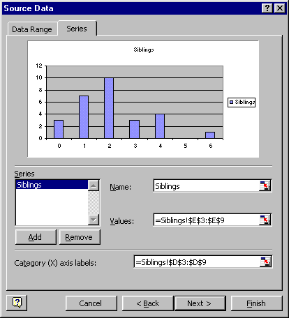
- Now click the "Series" tab at the top. This is where we set up some
of the X- axis format. "Series1" refers to the data and is associated
with both the chart legend and title. We'll give it a name here just
to try it out (we'll modify it later however). Type "Siblings" in
the empty Name space. You're done in that box (don't hit enter yet
or you'll go to step 3).
- Move your cursor to the Category (X) axis labels box. This is an
important feature; we assign the labels or categories to the X axis
here. One way is to type in the cells that contain our label names
(or categories or numbers). Use the cells D3:D9 since they are the
values of our random variables. You can use the red arrows or simply
put your cursor in the box and highlight the appropriate cells. Click
on "next" to go to Chart Wizard step 3.
- In Chart Wizard Step 3 we continue formatting and labeling the graph.
You don't have to get it exactly right in this step as it is easy to
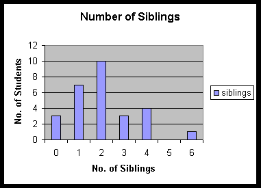
modify the graph later. Title the graph "Number of Siblings". Label
the X axis, "No. of Siblings", and label the Y axis "No. of Students".
Notice the other tabs at the top of this dialog box - Axes, Gridlines,
Legend, etc. Look at each of these and experiment. Click on Next to
go to the last step.
- Step 4 in Chart Wizard asks whether we want the chart on the worksheet
we are working with, in this case, Siblings, or put the graph on a new
worksheet. Leave it on the "Siblings" worksheet and finish.
- Adjust the graph to a convenient size. You do that by dragging the
black squares, called sizing handles, found around the chart. If those
squares aren't there, you can make them appear by selecting the chart
with a mouse click. Then reposition the chart to a convenient place
on your worksheet.
- You should now have a graph similar to the one below. Don't worry
too much if yours isn't perfect. Part of your assignment for this module
is to change it anyway.
Variations to the Basic Histogram
(Note: There is a lot of important information in this section - go slowly,
read thoroughly and carefully, understand what you are doing, and pay
attention to the details.)
Sometimes it is necessary to consolidate the data into groups. Suppose
you want to make a histogram of QPA's. (QPA's are the same as GPA's) You
would not want a category for 2.94, 2.95, 2.96, etc; that would create
a graph with over 200 categories along the X-axis. One approach is to
combine QPA's into groups, say 2.00-2.50, 2.51-3.00, etc. By grouping
data you will lose some information. For example, there may be 100 students
with QPA's between 2.00 and 2.50; by grouping them in this one category,
you don't know what the distribution of QPA's is within the category.
They may all be 2.48 or all 2.01.
Three basic decisions you must make are:
- How many categories (or groups) to make
- How wide to make each category interval (or class)
- The location (center and hence, end points) of each interval with
the goal of representing the data as accurately as possible.
If you have too few or too many categories, not enough information may
be conveyed. There are no firm rules. With the ease of building graphs
with computers you should construct and evaluate several then choose one
that best represents your data. Right now though, we are just interested
in the mechanics. We will cover these refinements after you feel comfortable
with making the tables and graphs.
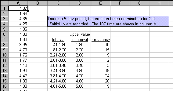
Use the data set located in oldfaithful.html.
There are 107 observations of the how long eruptions lasted (in minutes).
To get the data into Excel, open oldfaithful.html then save it (File-Save
as) to an appropriate drive/folder. Now, start Excel and open the html
file using Excel. You may not see your saved file when you do a File-Open
in Excel unless you change the "Files of Type:" selection (at the bottom
of the File-Open dialog box) to "All files".
Let's first construct a frequency table, grouping the data for eruption
times. Use the same =frequency function as you did for the Sibling example,
but there is one significant difference. Once you have an idea as to what
the number of intervals and width is to be, select the upper value of
each interval to be your "bin" value.
Mechanics of constructing a grouped data histogram
- Type in the three column headings as shown below. The category labels
that will be used for your graph should be typed in the "Interval" column,
C8:C16 in this example. These are just labels and are not needed
by Excel to do the frequency count. Note: If you type 1.81-2.20 Excel
may put -.39 in the cell because it thinks you are doing arithmetic.
You can make the numbers a text format by typing an apostrophe before
the numbers, '1.81-2.20.
- Take time to stop and reflect for a second and not just type numbers
in blindly. What are these intervals? How will they be used? How were
they arrived at? A good rule of thumb is to use between 4 and 15 categories
or intervals. I experimented with numerous combinations before I decided
that I would use 9 intervals, each of size 0.4 minutes and start 1.4
minutes. I cannot say this is the best result but, after looking at
various combinations, it appeared to represent the data effectively.
I started by finding the largest (4.93) and smallest (1.67) numbers
in the data set, using the =max and =min functions. That is a range
of 3.26. Nine intervals of 0.4 cover a range of 3.6 so I started a little
below the lowest number, 1.67, to overlap approximately equal amounts
at each end. I could have just as easily started at 1.5, 1.6, or 1.65.
Intervals of .3, .35, .45, .5, or .6 might also be appropriate. It is
important to ensure that each observation goes into one and only one
interval. Again, there are no hard and fast rules. You just need to
represent the data with as little loss of information as possible. It
will take some practice.
- In cells D8:D16, I used the Edit-Fill-Series tool (Step set to .4)
to input the upper limit of each interval (class, category, group)
- Now do =frequency in cells E8:E16 just like you did for the Sibling
frequency distribution. Don't forget to highlight all cells E8:E16 first.
Don't forget Control-Shift Enter. Excel should fill in cells E8:E16
just like the example above.
Here is what just happened - Excel looked at each entry in the Old Faithful
data set and put it in the appropriate class. It uses just the upper
limit of each class to do this. For example, for the second interval,
1.81-2.20, it really finds all values that are greater than 1.80 (the
upper limit of the preceding interval) and less than or equal to 2.20
(the upper limit of the category you are interested in). The 1.81-2.20
is just a text label you put in and has nothing to do with how the frequency
distribution is found. The upper limit values are the keys. Reread this
paragraph - it is important that you understand it!
- Try a few things to see what happens. Change the first value from
4.37 to 1.20. Your frequency distribution changes! The 4.21-4.60 interval
decreased from 20 to 19, as expected, but the 1.41-1.80 category increases
from 10 to 11. But wait, you say, the value 1.20 isn't in that range!
Correct! Excel doesn't care about your labels, it only knows that 1.20
is less than the 1.80 that is in cell D8. Remember Excel will put all
values less than 1.80 into that bin. Undo that change. (A quick way
to undo is to do Control Z, if you haven't done anything else). Let's
try something else. A22 contains a value of 4.60 minutes. If that value
is really 4.6000001 will our distribution change? Try it! What happened
and why?
Comments
You will be working with grouped data frequently so you must understand
how the =frequency function works with it. Make sure you can interpret
this table. For example, what does the 3 in cell E12 mean? Can you construct
and interpret the appropriate cf, rf, and crf tables for this data?
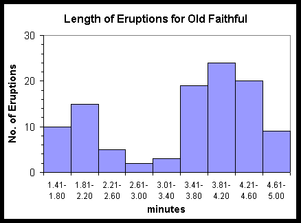
Graphing is the same but the intervals rather than the upper values of
the intervals will be the X-axis labels as shown below. Simply using the
upper values of the intervals as labels would make the graph misleading.
For example, if you were to use 1.80 as the label for the first category
instead of 1.41-1.80, that would indicate that there are 10 values equal
to 1.80 in the data set, which is incorrect.
You should be able to make a chart that looks exactly like this one.
Notice the background is white, the gridlines and legend are missing,
the axis labels and tick marks are not the default values, and the bars
are touching. There are literally hundreds of variations you can make
to graphs and you should be familiar with the majority of important options.
Some notes
It's time to step back for a breather and some clarification. Some of
the conflicting terminology and appearances of the visual displays no
doubt confuse you. I have used the terms frequency distribution, bar chart,
and histogram somewhat interchangeably, and not too precisely. To review,
a frequency distribution may be a table or a chart. Regardless, both display
the absolute frequency (the count) or relative frequency (proportions,
ratios) with which each attribute value (or group of values) appears.
The graph (or in Excel terms, the chart) can be, what we have called,
a bar chart or histogram. (Note that in Excel confuses the issue even
further where a Bar Chart is oriented horizontally, a Column Chart vertically.)
Even worse, technically speaking, a bar chart (or column chart) and a
histogram are not the same. Some texts specify that the heights of the
bars show the frequencies (or relative frequencies) in a bar chart, but
the areas inside the bars show the relative frequencies in a true
histogram. Other texts use histograms to show absolute or relative frequency
for quantitative variables only; others are even more strict and use them
only for continuous variables. Don't get hung up on these differing viewpoints.
You will not be tested on them. Concentrate on making tables and graphs
that accurately represent the data and not on the name. You will be working
primarily with bar charts.
Summarizing Data Using a Scatter Diagram
Preliminaries
For some data sets, we will want to show the relationship between two
quantitative attributes. For example, relationships between the amount
of training and product quality, or between SAT scores and QPA. A scatter
diagram (or Scatter Plot) is a two-dimensional graph that shows the relationship
of two attributes associated with each entity. Some texts called this
a bivariate relationship. One variable is plotted on the X axis; this
other, the Y axis. Scatter diagrams are extremely useful and used extensively
in many business applications. When analyzing relationships, you will
frequently assign the independent variable on the X axis and the dependent
variable to the Y axis. Also, you may use variations of scatter diagrams
to graph mathematical functions.
Having two variables associated with an entity is an important distinction
from a histogram. Recall that the X-axis on a histogram was categories;
on a scatter diagram the X-axis contains variables!
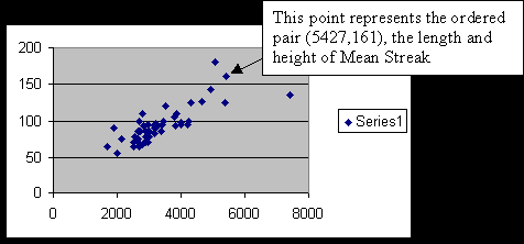
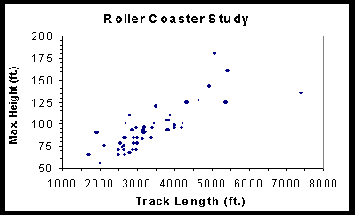
We will use the data in rollercoaster.htm
to demonstrate a scatter plot and examine relationship between the length
and maximum height of 50 wooden roller coasters in the United States.
Mechanics
- We will use chart wizard again but we don't need to construct a frequency
distribution table first. We can go directly to the data.
- On the worksheet select cells B5:B54 and D5:D54. To select two non-adjacent
columns, select B5:B54 then hold down the Control Key while selecting
D5:D54.
- Go to Chart Wizard, select XY (Scatter), then the first sub-chart.
Go to Step 2.
- In Step 2, the Series option is different from that of a frequency
distribution (bar chart). In many situations is important to understand
the problem and carefully define the independent and dependent variables.
Now, however, we are just interested in the mechanics of making a scatter
plot so we will just construct the plot and examine the relationship,
without regard to the dependent and independent variables.
- If you Finish now, without labeling the axes or graph, your scatter
diagram should look something like this:
Make the changes so the chart looks like the one below.
- Format Plot Area: background area white
- Chart options: Title, X & Y axis labels as below, delete legend and
gridlines
- Format Y-axis: Pattern - Major and Minor ticks outside
- Scale: Look carefully at Max, Min, Major Units, Minor Units.
- Format Data Series: Pattern Style, round; Size, 3
Graphing functions
Although graphs of functions are not typically used for summarizing a
data set, they are frequently used to provide visual displays of a wide
range of models. We will be developing numerous models in this course,
so you must be adept at constructing this type of graph using Excel. When
developing some models, you will frequency need to graph a mathematical
function, an equation, if you will. Recall how you graphed equations in
high school, before you had a graphing calculator. You selected 3, 4,
5, or so values of X, calculated the associated Y, plotted the points
(ordered pairs) and sketched in a line. We will do the same thing but
using a few nifty Excel features and letting it do the work.
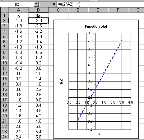
Let's graph a straight line with the equation Y = 2X + 1. A preferable
way of stating this is: Graph the function f(x) = 2x + 1. Since we want
to limit the size of the graph, we really don't need to graph it from
x = -Ą to x = +Ą;
use values of x from -2 to + 3 or -2 Ł x Ł
+3.
Open a new worksheet and label the first column "x"; the second, f(x).
Instead of us choosing values of x, say -2, 0, 1, and 3, and typing them
in, use the Edit-Fill-Series tool. Type a -2 in cell A2, then select A2
and Edit-Fill-Series in steps of 0.2 stopping at +3. (don't forget to
select "column") In cell B2 type the formula in Excel form, but substitute
"A2" for the "x". It should look like =((2*A2) + 1). I put extra parentheses
in and, while you don't need them here, you will want to use them judiciously
in more complex functions. What this does is put the contents of A2, the
value -2, into the formula and enters the result, -3, into cell B2. Copy
B2 to B3:B27. Look at the formula in some of the cells in column B. You
have effectively solved the equation 26 times, once for each of the values
we selected for x. Make sure you understand what you just did, why you
did it, and how it works. This is an especially useful technique.
Graph the function. You can actually use either "Scatter" or "Line" chart
types to graph functions. I strongly recommend you stick with scatter
charts. Scatter charts, using the sub-type with lines drawn in, allow
more formatting flexibility. Remember that each point on your graph is
an ordered pair of quantitative values. Line charts deal with categories
on the X axis, so may technically be the correct choice in some instances.
Scatter charts have values on the X axis. For what it is worth, I rarely
use line charts, except when time is the value along the X axis. Modify
your graph to make it look like the one below. Make sure that you understand
what is happening and be able to relate each number in your table to each
point on the graph. (I don't think you can make your graph look like this
if you choose Line type charts.)
As you have probably determined, even working with the basic graphs requires
considerable practice and there are dozens of other graph forms that we
have not even touched on. During your practice, keep in mind that the
end purpose is not to make the graph but to display data in a form useful
for information dissemination and decision making. Excel, and its many
graphing tools, is simply a tool to that end.
In many business reports you will want to show the changes of some value
over time. The sales of a product and the value of a portfolio are just
two examples. For these types of graphs, time will be along the X axis.
Line charts may be appropriate for this but you can also use a variation
of scatter plots as well. You can try both and make a determination about
what works best for your particular purpose.
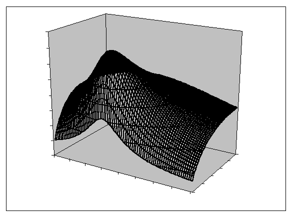
Graphs having three axes (x, y, and z) are called 3-D surface charts
in Excel. They are frequently used to show the effects of two variables
on a third. You are expected to learn how to plot a basic surface chart
on your own. A helpful hint is to layout your spreadsheet table as a two-dimensional
array with the x-axis value down a column, the y-axis data across rows,
and the z-axis data "inside" the array. You should be able to
type in one formula in the upper left cell of the array and copy it -
if you understand the use of "$'s" in Excel formula and associated
absolute and relative cell references!
Here is a surface plot of z = 4x/(x^2+y^2+1). In Excel formula,
"x^2" will raise x to the second power.
Assignments
For a maximum grade of B-
- Use the techniques in the notes to construct four basic graphs shown
in the notes:
a. The sibling graph
b. The Old Faithful graph
c. The roller coaster graph
d. The graph of function,Y=2X+1
For a maximum grade of B
- Complete the B- grade assignment.
- This remainder of this assignment is intended to have you find out
how to format just about everything on graph. There is no way you can
remember how to do it all the first time thorough, but at least you
will know that it can be done somehow.
Get the 172 numbers in the grades.html. These
numbers represent students' final averages in a course. I would like
you to make a table and histogram showing a relative frequency distribution
(in percentage form) of final grades.
Use your knowledge of frequency distributions, relative frequency distributions,
the =frequency function, etc. to construct a table showing the percentage
of students earning each letter grade. The grading scale for the data
is: Below 60, F; 60-69, D; 70-79,C; 80-89, B; 90-100, A.
Make a chart that looks as much like the one on the next page as your
are able. ***Your percentages for each letter grade will be not
be exactly the same as those shown.*** A checklist of chart
formatting is provided below.
Label the worksheet "Grades"
Construct a correct chart with any formatting
Place chart on same worksheet and size it appropriately
Chart Title - Font is Arial, bold, size 12
Category Axis Title - Font is Arial, regular, size 8
Value Axis Title - Font is Arial, regular size 8; notice alignment
Plot Area - no border, no grid, no color.
Value Axis
- Font is Times New Roman, regular, size 8
- Values are %'s (relative frequency)
- Pay attention to the values, range of values and tick marks
Category Axis
- Font is Times New Roman, regular, size 10
- No tick marks
Histogram Bar Pattern
- A lovely 2-color gradient fill with blue center and red edges
- Gap between bars is very small, size 10
- Notice the values above the bars
Text box (Hint: It's on the drawing toolbar.)
- No border
- Font is Arial, regular, white, size 8
- Background is lime green
Arrow (Hint: It's on the drawing toolbar.)
- Line width is 1.5 pts
- Color is red
- Special "arrowhead", not the default
For a maximum grade of B+
- Complete the B assignment.
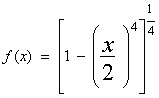
- Plot the famous Lamé Curve from -2 Ł x
Ł 2, (I suggest .05 increments.) You may
have to do some investigation to find out what it is supposed to look
like.
For a maximum grade of A-
- Complete the B+ assignment.
- You can find lots of financial data on the web. TIAA-CREF is an organization
that handles retirement accounts for educators
Go to http://www.tiaa-cref.org/charts/ra-performance.html
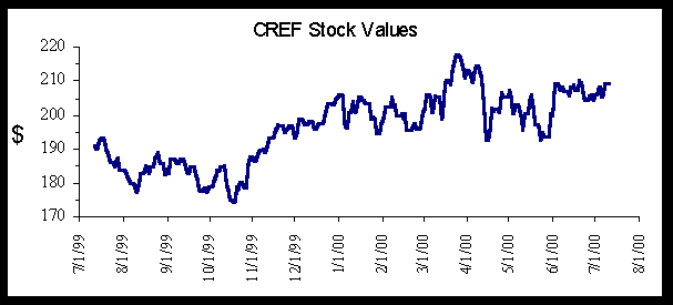
Click on Download data under Retirement Investments, on the right side, of the page and get 365 days of CREF Stock historical data. Put the information into
an Excel spreadsheet and plot the value over time to observe current
trends. Experiment with it; it can be quite useful. Depending upon how
you try to get the data into Excel, you may get a chance to work with
the Text Import Wizard. Also, this is one of the few times that a Line
chart is better than a scatter plot as you must use Line chart to get
the x-axis to plot correctly. If you have measurements of time in days,
weeks, months or years on the x-axis consider using line charts. Your
result should look something like this but your timeframe will be slightly
different.:
- Lissajous curves are elegant. Plot this one from t = -4 to +4 in 0.1
increments. x = a sin(nt+c), y = b sin(t), where a, b, and c = 1 and
n = 3. Search the internet to see what it is supposed to look like.
For a maximum grade of A
- Complete the A- assignment.
- Construct a 3-d surface plot that looks like the one in the notes.
Let x range from about -2.0 to 3.0 and y range from about 0.2 to 4.0. (Increments
of .1 are reasonable.) If yours doesn't look just like the one in the
notes, try switching the axes.
- Show friends and family all of your pretty graphs and include some
of their comments.
|
|